Makazai
Can the shape of a bottle help a brand stand out in a crowded category?
Industrial Design
2020

About
Makazai is a rum from the coastal Indian state of Goa. A new brand entering a crowded category, it needed an identity strong enough to stand out on shelf and carry the character of the place it comes from.
The owners approached Popping Mustard to develop the brand. I worked with Bidisha on the bottle design and 3D visualization of the final labels. The overall brand concept and label design were developed by Bidisha.
The bottle is clean and unfussy: a straightforward form that steps back and lets the label do the work. An embossed logo on the reverse adds a tactile detail without competing with the front face.


Point-of-Purchase
Alongside the bottle, I designed a range of point-of-purchase displays extending the brand language into retail. Two routes were developed, each with wall bay and counter top units.
Route 1
Route 1 draws directly from the brand's existing assets and colour palette. The unit is divided into two halves to showcase the two varieties, with a layered glass installation at the centre that highlights the turtle illustration, adding depth and a focal point without overcomplicating the display.

Wallbay 1

Wallbay 1

Wallbay 1 Detail

Counter Top Unit 1

Counter Top Unit 1
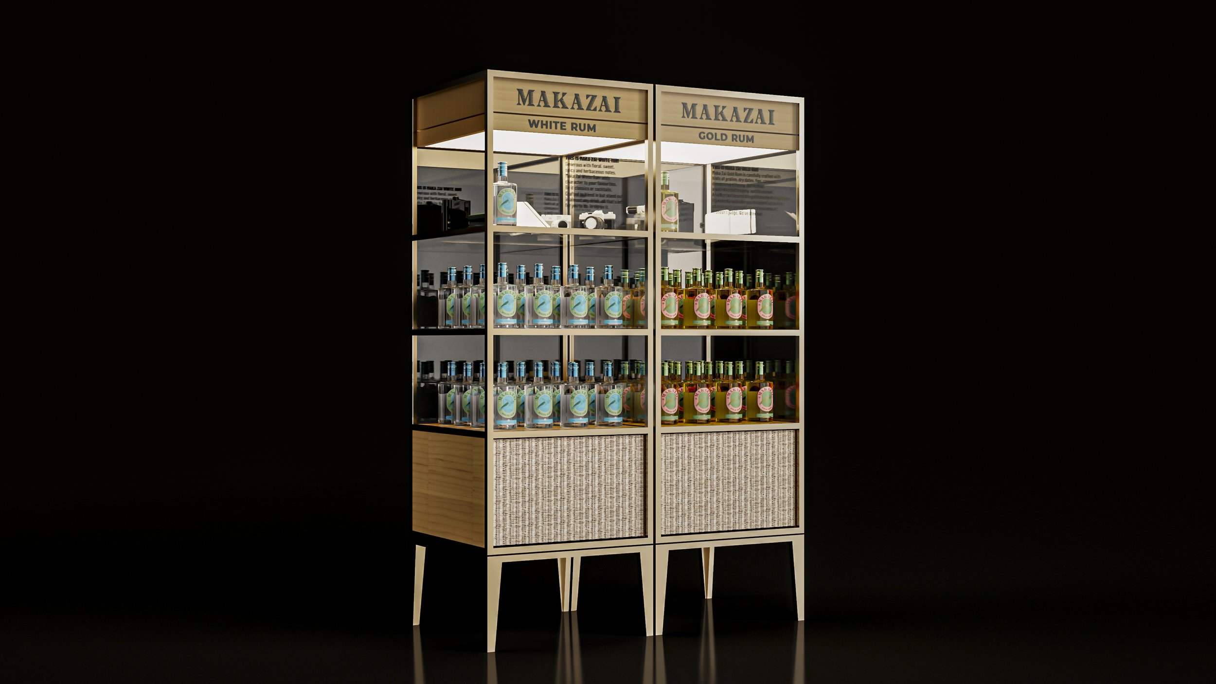
Route 2
Route 2 takes a different direction, inspired by vintage curio cabinets and the souvenirs of a well-traveled life. The bottles sit alongside cameras, journals, and the other accoutrements of a certain kind of traveler. Warm wood and wicker with a brass frame; a display that feels like it belongs in someone's home as much as a bottle shop.
Wallbay 2

Wallbay 2

Wallbay 2 Detail

Counter Top Unit 2

Counter Top Unit 2
Other Point-of-Purchase Units
A wall unit and shelf unit were also designed for broader retail environments.

Shelf Unit 1

Shelf Unit 1

Shelf Unit 2

Shelf Unit 2